
Creating Custom Interaction
Buttons in Sprotty work similarly to the other model elements, but they enable you to directly hook up handlers that react to the push of a button.
As in the other examples with other types of nodes, we first need to define the model and view class and define its type ID. in addition, we also need to define a button handler of type IButtonHandler.
const container = new ContainerModule((bind, unbind, isBound, rebind) => {
        const context = { bind, unbind, isBound, rebind };
        configureModelElement(context, 'graph', SGraph, SGraphView);
        configureModelElement(context, 'button:custom', SButton, CustomButtonView);

        configureButtonHandler({bind, isBound}, 'button:custom', CustomButtonHandler);

        configureViewerOptions(context, {
            needsClientLayout: true,
            baseDiv: 'sprotty'
        });

    });
A button handler is a simple injectable class with a buttonPressed(button: SButton): Action[] method.
The actions that this method returns are passed to the ActionDispatcher to be handled there.
@injectable()
export class CustomButtonHandler implements IButtonHandler {
    buttonPressed(button: SButton): Action[] {
        alert('button on' + button.parent.id + ' pressed');
        return [];
    }
}
Sprotty also offers the ability to attach mouse and keyboard listeners by registering MouseListener or KeyListener.
This can be simply done by binding the custom listener to the respective listener type in your DI-container like this:
    bind(CustomMouseListener).toSelf().inSingletonScope();
    bind(TYPES.MouseListener).toService(CustomMouseListener);
These listeners are global, meaning they react to every interaction with the diagram. A very simple mouse Listener would look like this:
export class CustomMouseListener extends MouseListener {
    doubleClick(target: SModelElementImpl, event: MouseEvent): (Action | Promise<Action>)[] {
        alert('double clicked ' + target.id)
        return [];
    }
}
If only specific types of nodes are supposed to be interacted with through this custom listener, it’s recommended to create a custom feature.
Another interactive Sprotty feature is the ProjectedViewportView.
This view automatically adds a vertical and horizontal scrollbar to our diagram view in which our current viewport is shown, like in the following image.
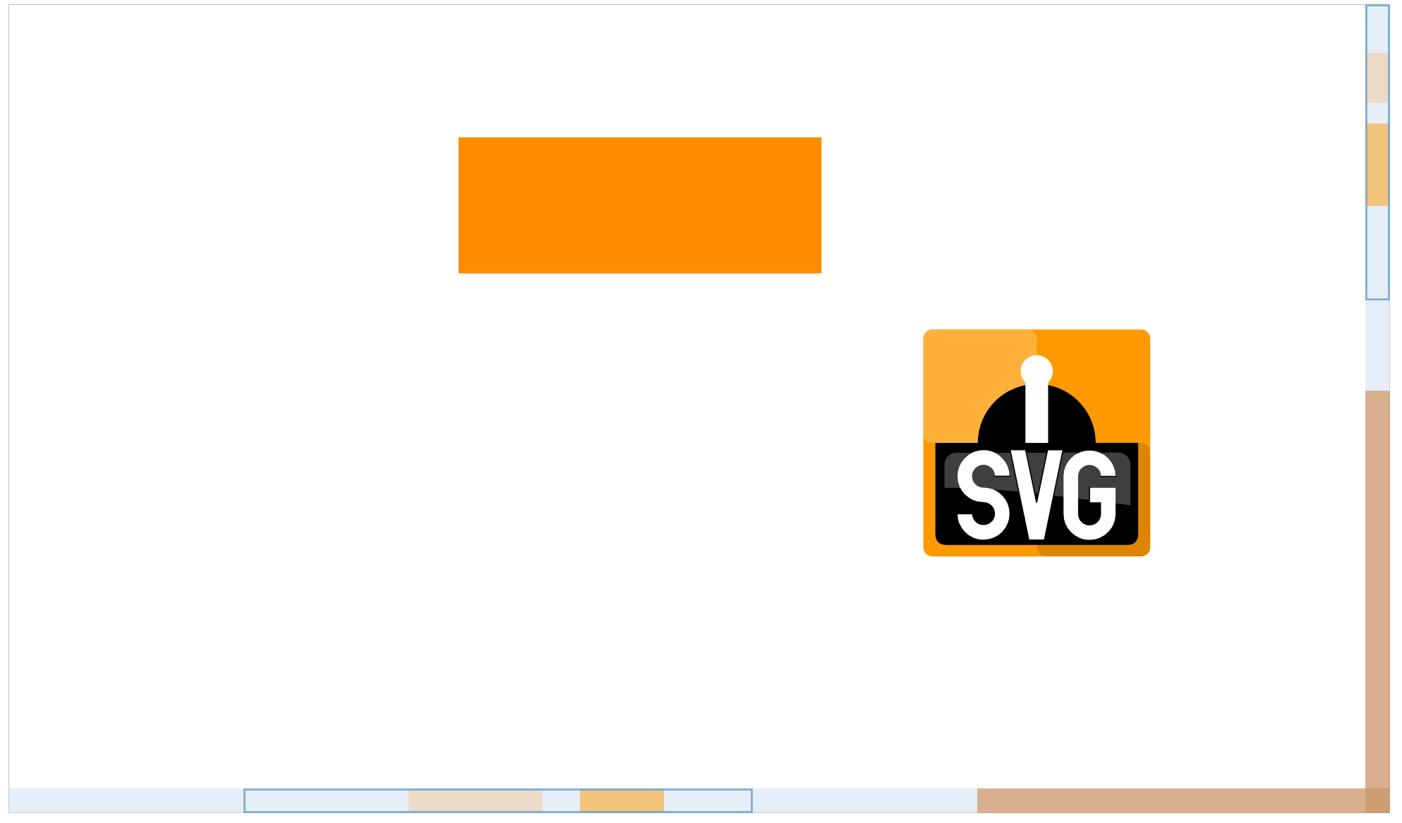
To activate this feature, instead of using SGraphImpl and SGraphView for our root element, as we did in the other examples, we use ViewportRootElement and ProjectedViewportView.
The scrollbars created through ProjectedViewportView can be styled via the .sprotty-viewport and .sprotty-projection-bar CSS classes.
As we can see in the image, these scrollbars can contain projections of our nodes, which show their horizontal and vertical position. Double-clicking on a projection will center the view on the node the projection belongs to.
To add projections we add the Projectable type to the nodes in our model schema like this:
 <SNode & Projectable>{
            id: 'svg',
            type: 'node:svg',
            text: '',
            projectionCssClasses: ['svg-projection']
}
The Projectable interface requires us to specify the projectionCssClasses property, which defines the CSS classes the framework will apply to the HTML div element that represents the projection in the projection bar. If no projectionCssClasses property value is specified, no projection will be created.
As projections are simple HTML div elements positioned on the projection bar, they can easily be styled as follows:
.svg-projection {
    background-color: rgba(255, 153, 0, 0.5);
}