
Micro-layout
Any model element that implements or extends the SNode or SCompartment interface has an optional property layout that specifies the general layout of its children elements. Sprotty implements three layout configurations by default:
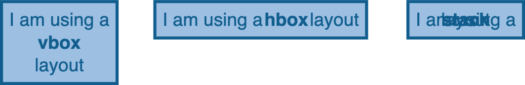
stack: children elements are stacked on top of each other (default layout)hbox: children elements are arranged horizontallyvbox: children elements are arranged vertically
The layout property aims at arranging children elements that do not have a meaning in terms of graph hierarchy (i.e. labels, buttons, …). Please note that children that are instances of SNodeImpl do not respect the layout property by default (more on that later).
First and foremost, the micro-layout engine needs to be activated in the inversify container. This is done by setting the needsClientLayout property to true in the inversify container configuration:
const module = new ContainerModule((bind, unbind, isBound, rebind) => {
    const context = {bind, unbind, isBound, rebind};
    ...
    configureViewerOptions(context, {
        needsClientLayout: true
    })
})
Let’s now have a look at the following graph containing 3 nodes with 3 label children, each with a different layout configuration:
export const graph: SGraph = {
    type: 'graph',
    id: 'graph',
    children: [
        // this node is using a 'vbox' layout
        <SNode>{
            type: 'node',
            id: 'node01',
            layout: 'vbox',
            children: [
                <SLabel> {
                    id: 'label01-1',
                    text: 'I am using a',
                    type: 'label',
                },
                <SLabel> {
                    id: 'label01-2',
                    text: 'vbox',
                    type: 'label',
                    cssClasses: ['layout-label']
                },
                <SLabel> {
                    id: 'label01-3',
                    text: 'layout',
                    type: 'label',
                },
            ]
        },
        // this node is using a 'hbox' layout
        <SNode>{
            type: 'node',
            id: 'node02',
            layout: 'hbox',
            position: { x: 100, y: 0 },
            children: [
                <SLabel> {
                    id: 'label02-1',
                    text: 'I am using a',
                    type: 'label',
                },
                <SLabel> {
                    id: 'label02-2',
                    text: 'hbox',
                    type: 'label',
                    cssClasses: ['layout-label']
                },
                <SLabel> {
                    id: 'label02-3',
                    text: 'layout',
                    type: 'label',
                },
            ]
        },
        // this node is using a 'stack' layout
        <SNode>{
            type: 'node',
            id: 'node03',
            layout: 'stack',
            position: { x: 265, y: 0 },
            children: [
                <SLabel> {
                    id: 'label03-1',
                    text: 'I am using a',
                    type: 'label',
                },
                <SLabel> {
                    id: 'label03-2',
                    text: 'stack',
                    type: 'label',
                    cssClasses: ['layout-label']
                },
                <SLabel> {
                    id: 'label03-3',
                    text: 'layout',
                    type: 'label',
                },
            ]
        },
    ]
};
This results in the following visuals:
If you want different layout configurations, you can implement your own micro-layout engine and inject it via Dependency Injection.
It is possible to fine-tune the micro-layout by using the property layoutOptions.
<SNode> {
    ...
    layout: 'vbox',
    layoutOptions: {
        ...
    }
}
You can control how children are aligned with the following properties:
hAlign: 'left' | 'center' | 'right'for the horizontal alignment (not available for layouthbox)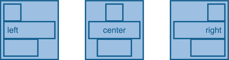
vAlign: 'top' | 'center' | 'bottom'for the vertical alignment (not available for layoutvbox)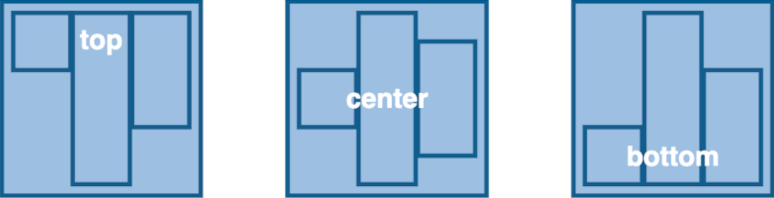
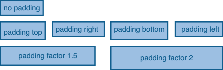
Spacing between the container and its children is controlled by the following properties:
paddingTop: numberfor the padding at the top of the container (in pixels)paddingRight: numberfor the padding at the right of the container (in pixels)paddingBottom: numberfor the padding at the bottom of the container (in pixels)paddingLeft: numberfor the padding at left top of the container (in pixels)paddingFactor: numberto define a factor for the padding depending on the size of the container
The micro-layout engine takes care of computing the size of a container depending on the size and position of its children. This can lead to unesthetic results, if for example the size of labels differs greatly between nodes. To deal with these issues, you can configure the following properties:
minWidth: numberto set the minimal width of a container (in pixels)minHeight: numberto set the minimal height of a container (in pixels)resizeContainer: booleanto indicate if the size of a container is dependent on the size of its children
The position of the children elements (given as x-y coordinates) is always relative to their parents. This means that to position a child element for example at the top left corner of its parent, you need to set its position to {x: 0, y: 0}.
SCompartments are used to group SModelElements and apply a given layout to this group. This allows for creating complex layouts inside of a node.
For clarity and illustration purpose, the SCompartments in the following diagram have a red outline, but you usually would not want to display it. Sprotty comes with a SCompartmentView that creates only a g element grouping its nested element. The g element does not result in any shape and is used only for grouping purposes.
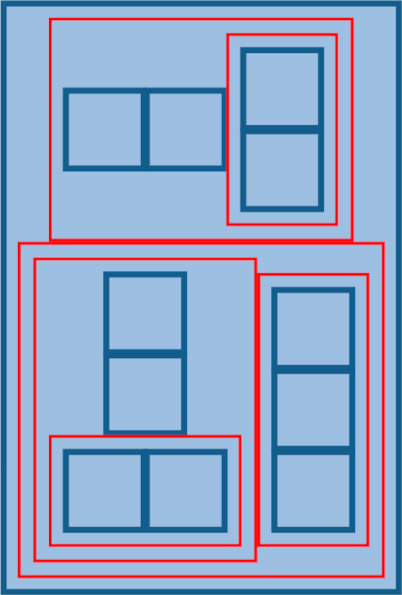
The following code snippet shows how to organize your model elements by including SCompartments to achieve the layout shown above:
export const graph: SGraph = {
    type: 'graph',
    id: 'graph',
    children: [
        <SNode>{
            type: 'node',
            id: 'node01',
            layout: 'vbox',
            children: [
                <SCompartment>{
                    type: 'comp',
                    id: 'comp01',
                    cssClasses: ['red-outline'],
                    layout: 'hbox',
                    layoutOptions: {
                        paddingTop: 5,
                        paddingBottom: 5,
                        paddingLeft: 5,
                        paddingRight: 5,
                    },
                    children: [
                        <SNode>{
                            type: 'node',
                            id: 'node02',
                            size: { width: 25, height: 25 },
                        },
                        <SNode>{
                            type: 'node',
                            id: 'node03',
                            size: { width: 25, height: 25 },
                        },
                        <SCompartment>{
                            type: 'comp',
                            id: 'comp02',
                            cssClasses: ['red-outline'],
                            layout: 'vbox',
                            layoutOptions: {
                                paddingTop: 5,
                                paddingBottom: 5,
                                paddingLeft: 5,
                                paddingRight: 5,
                            },
                            children: [
                                <SNode>{
                                    type: 'node',
                                    id: 'node04',
                                    size: { width: 25, height: 25 },
                                },
                                <SNode>{
                                    type: 'node',
                                    id: 'node05',
                                    size: { width: 25, height: 25 },
                                },
                            ]
                        }
                    ]
                },
                <SCompartment>{
                    type: 'comp',
                    id: 'comp05',
                    cssClasses: ['red-outline'],
                    layout: 'hbox',
                    layoutOptions: {
                        paddingTop: 5,
                        paddingBottom: 5,
                        paddingLeft: 5,
                        paddingRight: 5,
                    },
                    children: [
                        <SCompartment>{
                            type: 'comp',
                            id: 'comp03',
                            cssClasses: ['red-outline'],
                            layout: 'vbox',
                            layoutOptions: {
                                paddingTop: 5,
                                paddingBottom: 5,
                                paddingLeft: 5,
                                paddingRight: 5,
                            },
                            children: [
                                <SNode>{
                                    type: 'node',
                                    id: 'node06',
                                    size: { width: 25, height: 25 },
                                },
                                <SNode>{
                                    type: 'node',
                                    id: 'node07',
                                    size: { width: 25, height: 25 },
                                },
                                <SCompartment>{
                                    type: 'comp',
                                    id: 'comp04',
                                    cssClasses: ['red-outline'],
                                    layout: 'hbox',
                                    layoutOptions: {
                                        paddingTop: 5,
                                        paddingBottom: 5,
                                        paddingLeft: 5,
                                        paddingRight: 5,
                                    },
                                    children: [
                                        <SNode>{
                                            type: 'node',
                                            id: 'node08',
                                            size: { width: 25, height: 25 },
                                        },
                                        <SNode>{
                                            type: 'node',
                                            id: 'node09',
                                            size: { width: 25, height: 25 },
                                        },
                                    ]
                                }
                            ]

                        },
                        <SCompartment>{
                            type: 'comp',
                            id: 'comp06',
                            cssClasses: ['red-outline'],
                            layout: 'vbox',
                            layoutOptions: {
                                paddingTop: 5,
                                paddingBottom: 5,
                                paddingLeft: 5,
                                paddingRight: 5,
                            },
                            children: [
                                <SNode>{
                                    type: 'node',
                                    id: 'node10',
                                    size: { width: 25, height: 25 },
                                },
                                <SNode>{
                                    type: 'node',
                                    id: 'node11',
                                    size: { width: 25, height: 25 },
                                },
                                <SNode>{
                                    type: 'node',
                                    id: 'node12',
                                    size: { width: 25, height: 25 },
                                },
                            ]
                        }

                    ]
                }
            ]
        },]
};
By design, nested SNode do not obey the layout property of an SNode parent. This is because nested nodes are usually used to represent a graph hierarchy, and the layout of the children of a node is not relevant for the structure of the graph. In general, the position of those nodes should be the responsibility of the macro-layout engine.
However, if you still need the micro-layout engine to control the position of nested nodes, this can be achieved by enabling the layoutableChildFeature in the inversify container.
configureModelElement(context, 'your node type', SNodeImpl, YourNodeView, {enable: [layoutableChildFeature]})